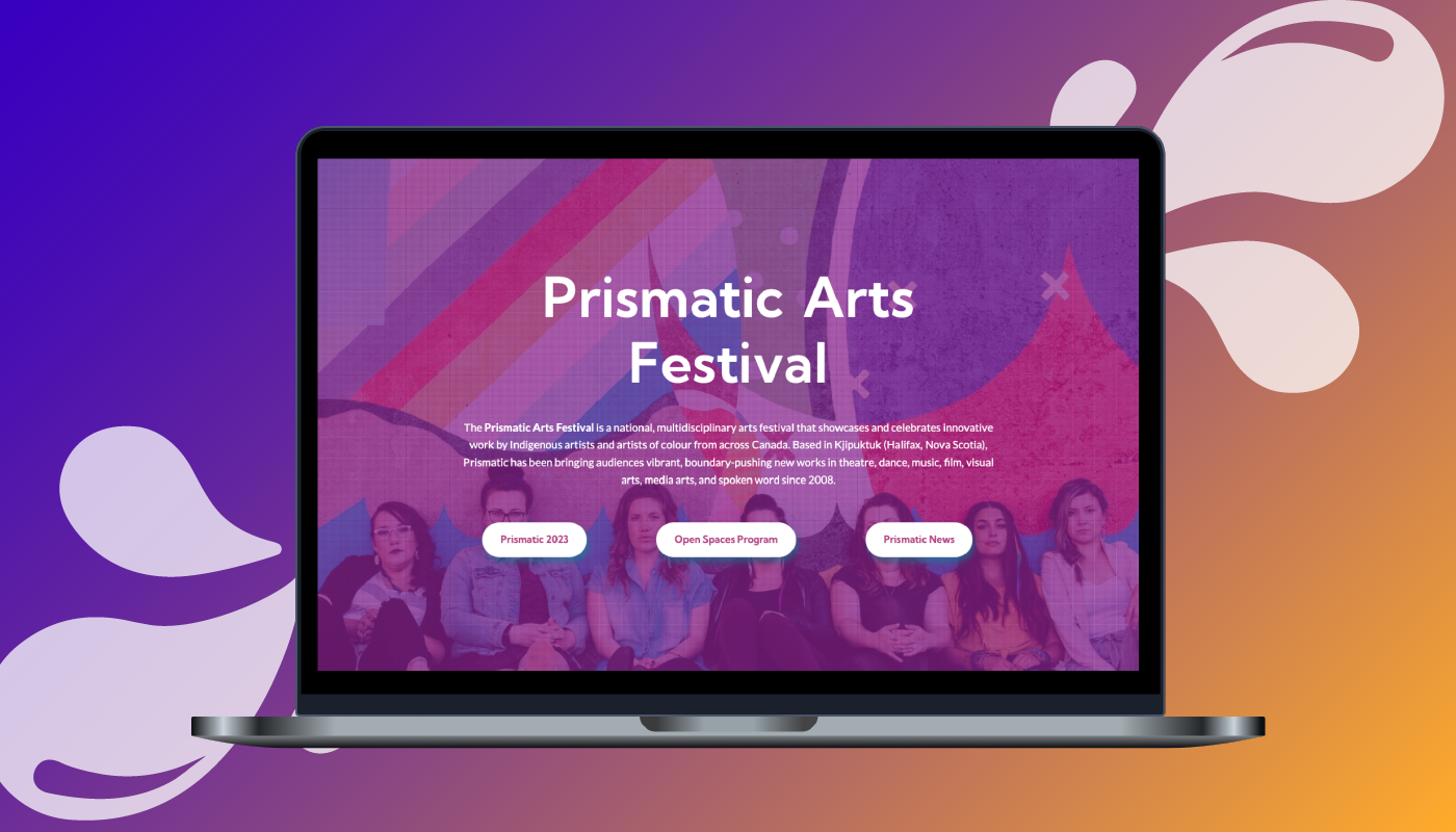
Prismatic Arts Festival
The Client — Prismatic Arts Festival
The Prismatic Arts Festival is a national, multidisciplinary arts festival that showcases innovative work by Indigenous artists and artists of colour across Canada.
The Task — A UX update and a design overhaul on Wordpress
When Prismatic reached out to me in 2021, they needed help updating the look and feel of their site, as well as assistance with making their site more user-friendly. They observed that their audience had difficulty planning out how to spend their time at the festival through the website. They also remarked on how disconcerting it felt to navigate the site since there was no unifying style guide.
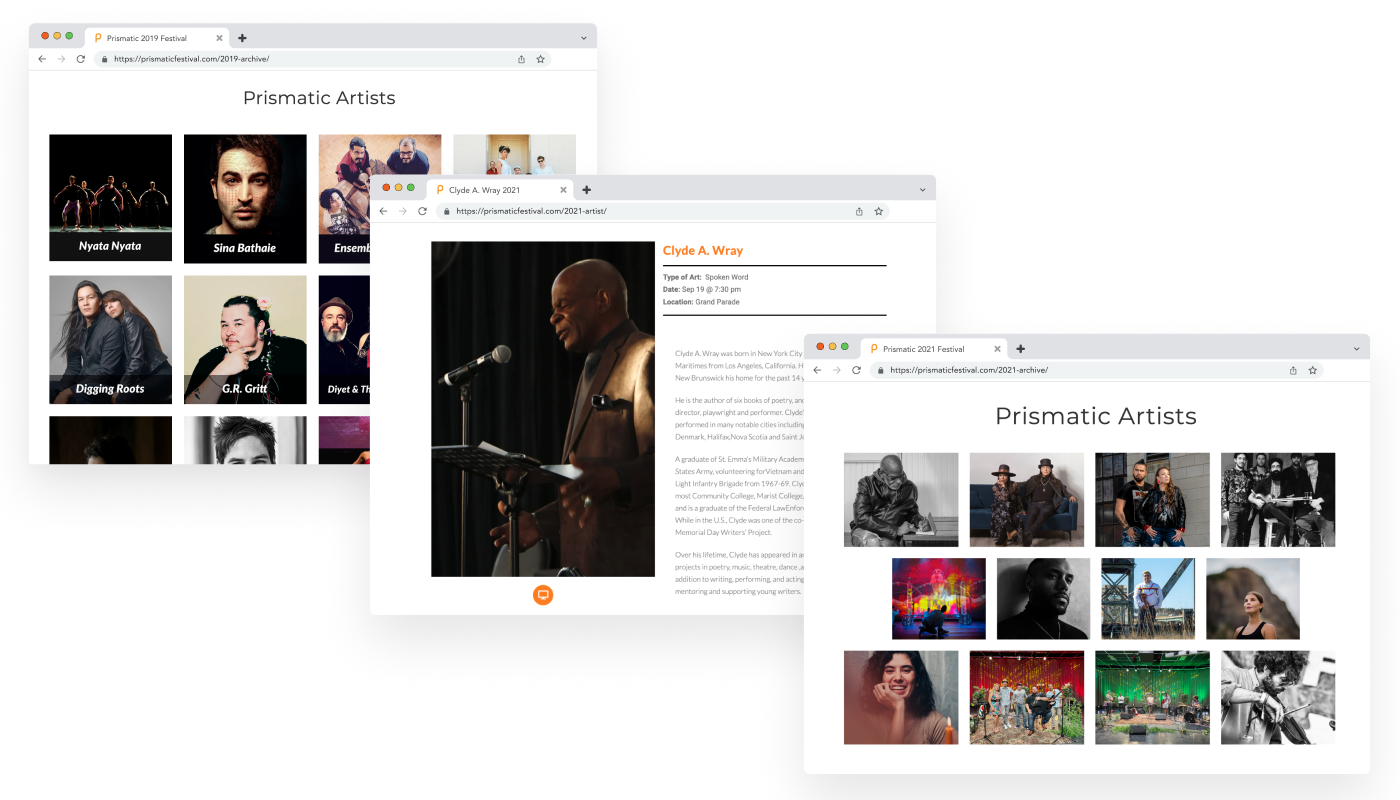
A sample of some Prismatic webpages before 2021
The Solution — Improving upon Prismatics' UX/UI Design
Part One: Improving User Experience
To address the challenge of planning one’s festival time online, I put myself into the audience’s shoes and came up with these three user statements:
- As a festival attendee, I would like to see a full festival schedule on the website;
- As a festival attendee, I want to purchase tickets for events I’m interested in easily;
- As a festival attendee, I want to know where the festival events are taking place so that I may plan my travel time accordingly.
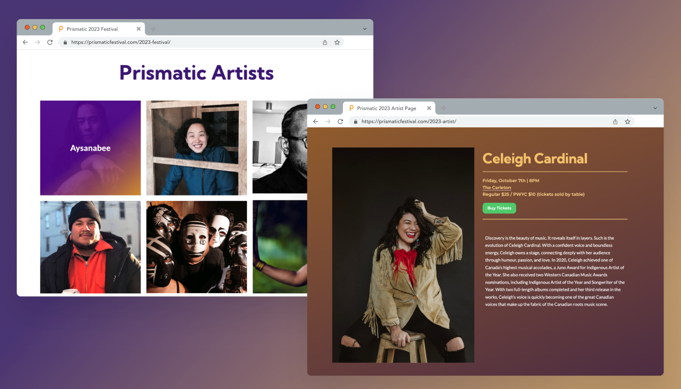
The first thing I set out to do was to include ticket information as well as a distinct call-to-action button on every artist's event page. Whether the event required a ticket, or was free upon registration, the call-to-action button made it clear where the audience should go in order to reserve their spot.
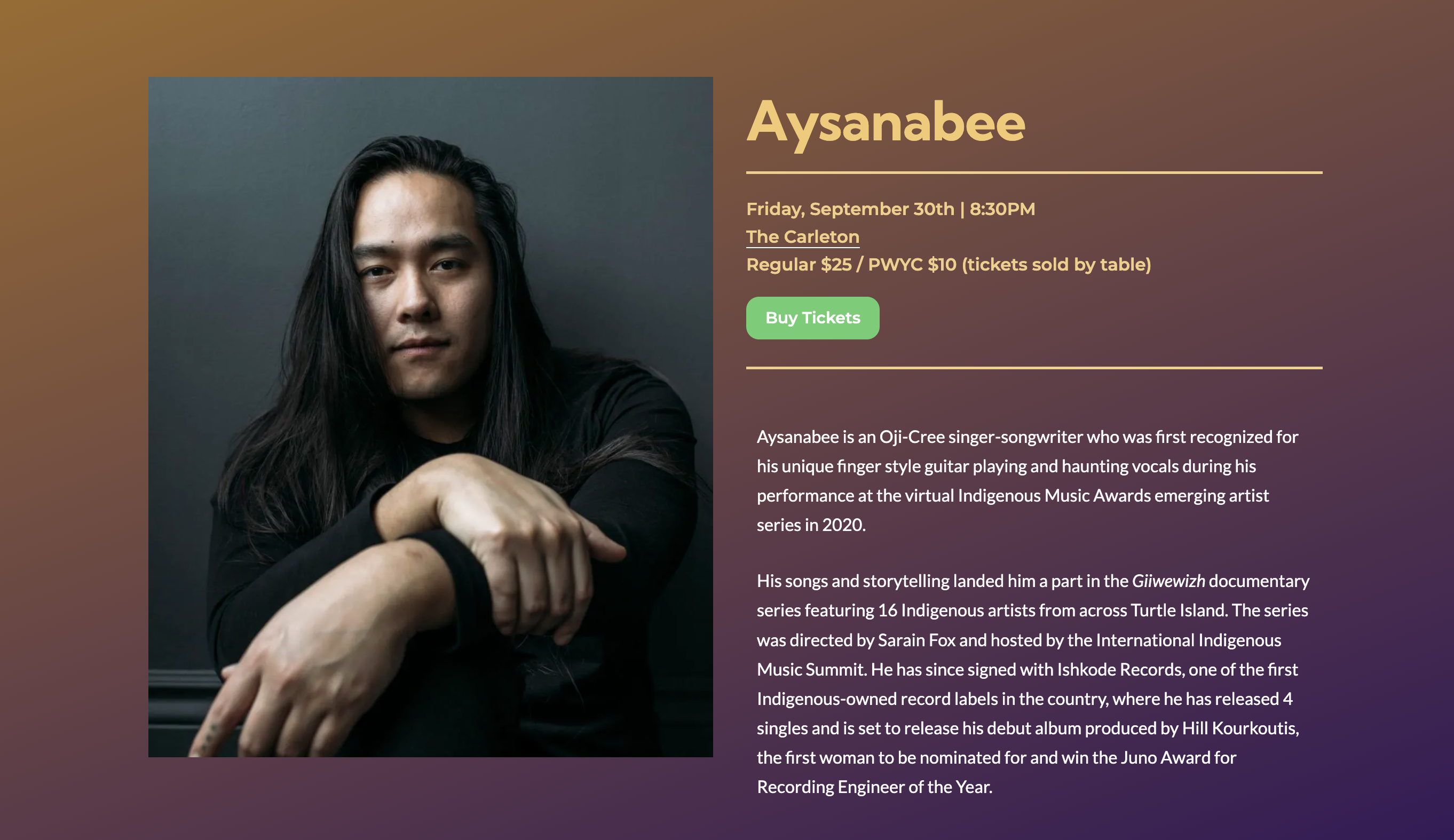
An artist page with a call-to-action button
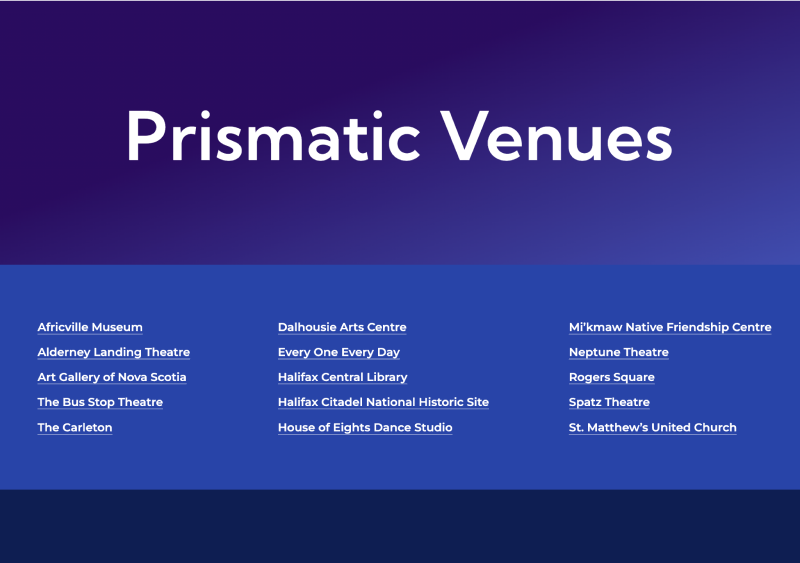
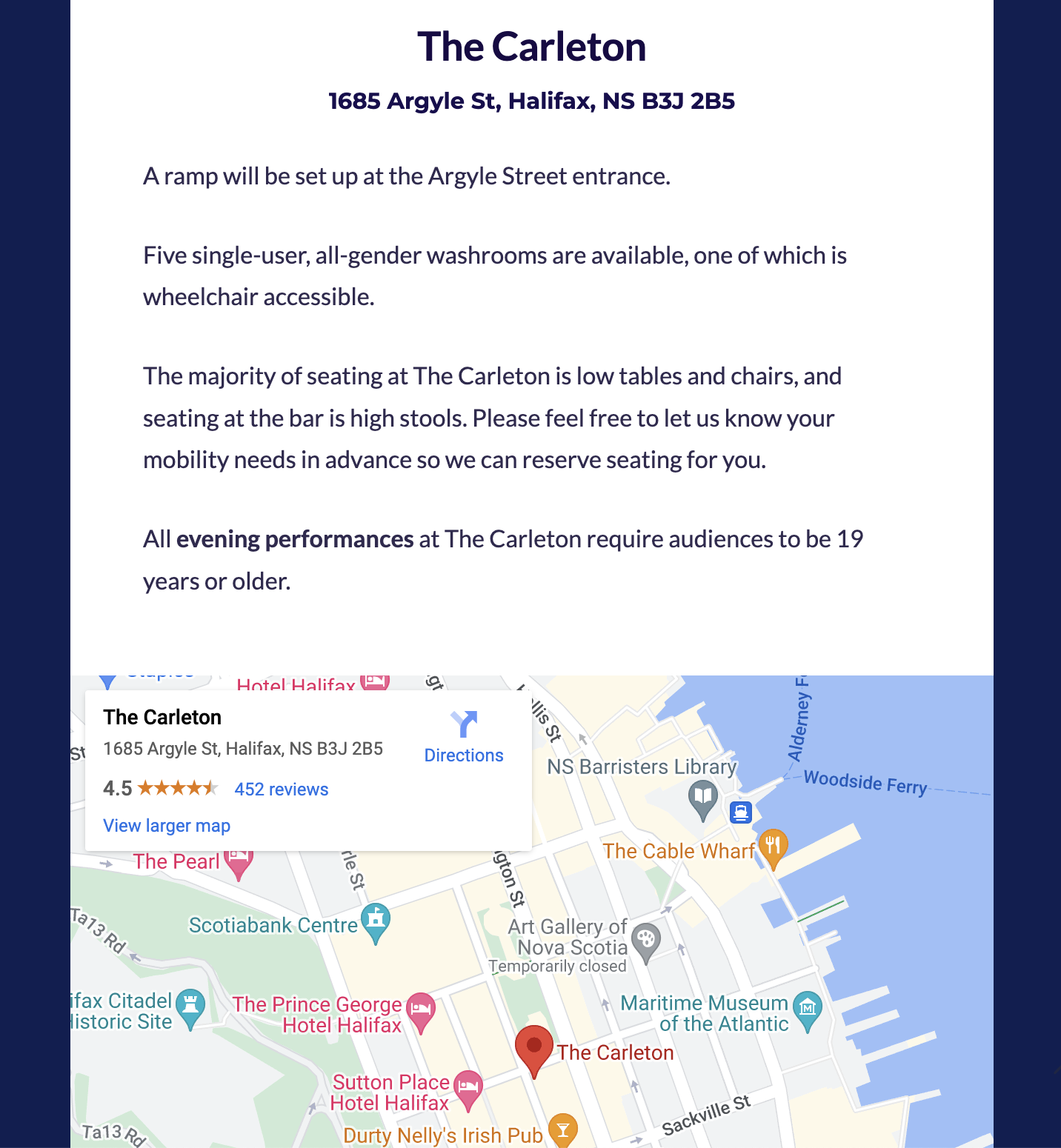
Secondly, I created a separate page to host all of Prismatic's event venues. This allows festival attendees to easily locate and plan their festival route. The page features a table of contents listing all of Prismatic's past and present venue locations. Each location entry includes the venue name, address, a Google Maps preview, and extensive accessibility information provided by Prismatic. Additionally, each artist's event page now included a hyperlink to their event location, alongside their performance details. Clicking on this hyperlink directs users to the specific venue information corresponding to their selected event.
Lastly, the third major feature we implemented as a team was an interactive festival schedule on the website. Within the constraints of a website template (Elementor), I crafted the schedule to closely resemble a calendar. Users could utilize the drop-down toggle on the table to compare schedules for their preferred dates and collapse irrelevant information. Moreover, the color-coded schedule enabled the public to easily identify which events they could attend. For instance, Prismatic's Industry events were designated in brown, denoting networking opportunities reserved for students and working professionals. Each event listing in the schedule included hyperlinks to the specific event and its location. This allowed the public to delve deeper into event details or refresh their memory by simply clicking on the hyperlinks.
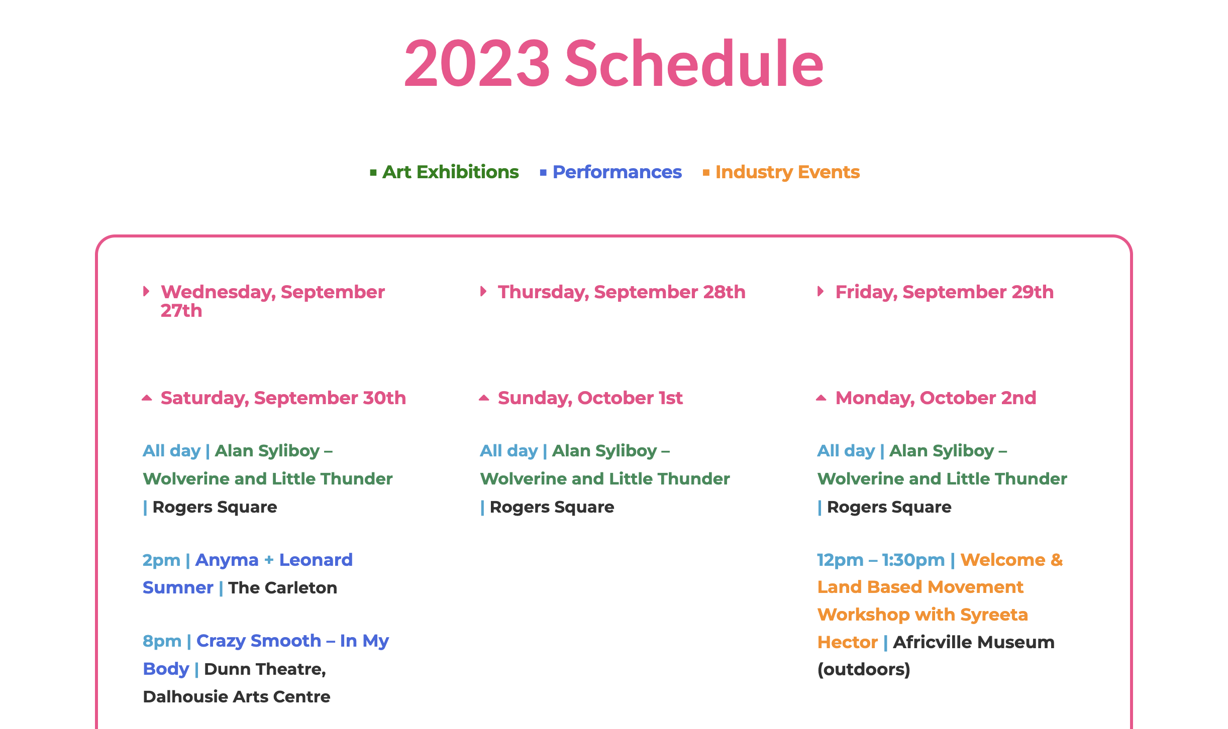
Prismatic's Festival schedule in 2023
Part Two: Designing visually engaging and resusable templates
Previously, Prismatic’s webpages relied heavily on their brand-coloured font on a white background. While these solid hues offered significant contrast, they failed to convey the dynamic nature of the arts organization they represent. Reflecting on Prismatic’s mandate: 'To bring new works of leading Indigenous artists and artists of colour from across Canada to a wide audience, I made the decision to infuse more vibrancy into Prismatic’s website. I blended their brand colours to form gradients, adding visual interest, while also prioritizing web accessibility.
In terms of improving the site’s consistency, I restyled the artist catalogue into uniform boxes, laid out clearer visual hierarchy, and made the header, subheader and paragraph text styles consistent throughout.
I also decided to create a fresh, inspired color-gradient palette each year to enhance the excitement surrounding Prismatic's festival launch.
The inspired colour palette in 2022
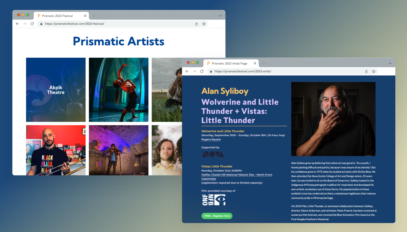
The inspired colour palette in 2023
The Result — A cohesive visual identiy and an enjoyable user experience!
While there was no formal data available to compare with previous years before I joined, we received overwhelmingly positive feedback from participating artists and longtime festival attendees, who specifically noted the enhanced look and feel of the website. Additionally, we observed a remarkable 160% increase in average user retention, attributed to the improved visuals.